The street food stall
I was at a meat skewer stall on the sidewalk, and the guy was doing everything alone. Welcoming customers, writing orders, flipping skewers, charging, giving change, and in the middle of it all, scribbling into a greasy little notebook what had been sold. Five roles, one pair of hands.
The notebook was smeared with grease, with a bent wire binding. And it worked flawlessly.
I couldn't shake that observation. It's 2026. Since ancient Egypt, humans have recorded transactions on physical media. After all these millennia, and forty solid years of commercial software, street vendors still choose pen and paper. Not out of nostalgia. Out of raw efficiency.
That is either a mystery or a diagnosis. I wagered it was a diagnosis.
What research revealed
Before writing a single line of code, I did two things.
First, I listened. I visited street markets, sidewalks, pastry stalls, snack carts. I asked who takes notes, who doesn't, and the question that actually matters: who had tried taking notes on their phone and given up?
The pattern emerged immediately. Almost everyone who had tried had quit. And the reason was never “the app was badly programmed.” It was always a variation of the same sentence: “it’s too much work.”
Next, I downloaded the competition. A dozen of them. Installed them, signed up, and tried registering a single $8 meat skewer sale as if I were the street vendor facing a line of customers.
Not a single one allowed it in fewer than six taps.
select payment method → choose tax category → confirm → return to home
None of those apps are bad software. Many are exceptionally well engineered. The problem is structural: they were designed for businesses with inventory, suppliers, accountants, and corporate tax IDs, and then sold to someone with a grill and a cooler. Every single field exists because someone, somewhere, needs it. But the sum of all fields everyone needs is a labyrinth for someone who needs two.
With a line forming and meat burning on the grill, six decisions cost more than a pencil scribble. So the scribble wins. It always has.
The notebook doesn't win by being great. It wins because the alternative is worse.
The criterion that became architecture
I left research with a strict number, not a feature list:
One tap on the product. One tap on confirm. Done.
That sounds like a UI design goal. It isn't. It's an architectural constraint, and it kills features before they can ever be born. Look at what it eliminates:
- No “new sale” screen. If you must open a sale before making a sale, you've already wasted a tap on bureaucracy. The home screen is the point of sale.
- No search input. Searching requires typing; typing opens the keyboard; the keyboard consumes half the viewport. All products sit directly in a single visible list.
- No quantity picker modal. There are simple
[-]and[+]buttons beside each product, with the number in between. Three skewers mean three taps on+—the exact gesture of someone counting on their fingers. - No payment method picker. Cash, instant transfer, and card all flow into the same day's revenue. The vendor knows what came in, their notebook never asked, and gross revenue is identical in all three cases.
- No register closing routine. The day flips automatically at midnight. The device clock already knows today’s date; asking the vendor to close the register is asking them to do the computer’s job.
- No signup wall to get started. Open and use. An account is strictly optional.
Each absence was an explicit decision made against the intuition of “what if someone needs this?”. Yes, someone will need it. And they can use one of the other twelve apps that handle it well. This app does one thing.
The screen
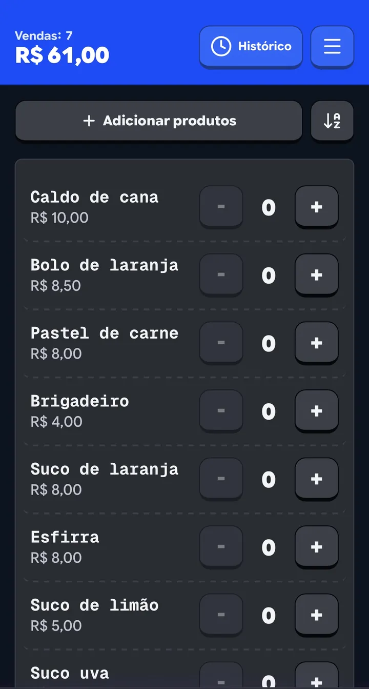
The main screen is a single list.
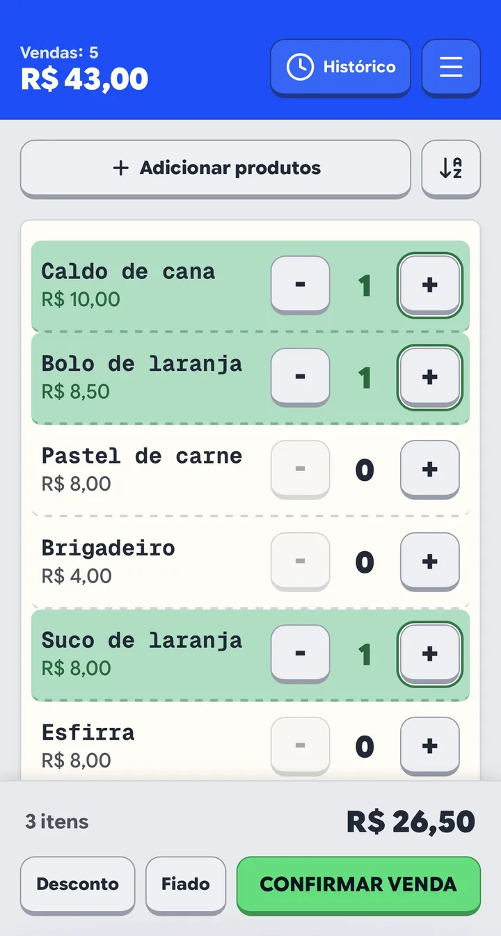
Each row displays the product name in monospace type, the price beneath, and on the right the three essential controls: [-], the quantity, [+]. The entire row shifts color as soon as quantity exceeds zero: light green surface, green border, green numeral. You perceive the full order at a glance without reading text.
When items exist in the cart, the bottom confirmation bar slides up with the total. One tap on it and the sale is recorded, the list resets to zero, and the header counter ticks up.
The list self-sorts by popularity. Best-selling items float straight to the top. Nobody hunts for an item; the item travels to the finger. If the vendor sells beef skewers, chicken skewers, and soda, and beef represents 60% of volume, it stays on row one by construction, not configuration.
This had an unforeseen side effect I had to solve: with 20 or 30 catalog items, popularity sorting scatters top sellers throughout alphabetical order, making rare items harder to find. The solution was not changing default sorting. It was an alphabetical sort toggle that represents transient state, not navigation. It sorts the list in place and resets upon reload.
The header tallies the day. Two lines: Sales: 12 above, $ 148.00 below in prominent type. It’s the metric vendors glance at between customers, always visible without opening any sub-menu.
The day closes itself
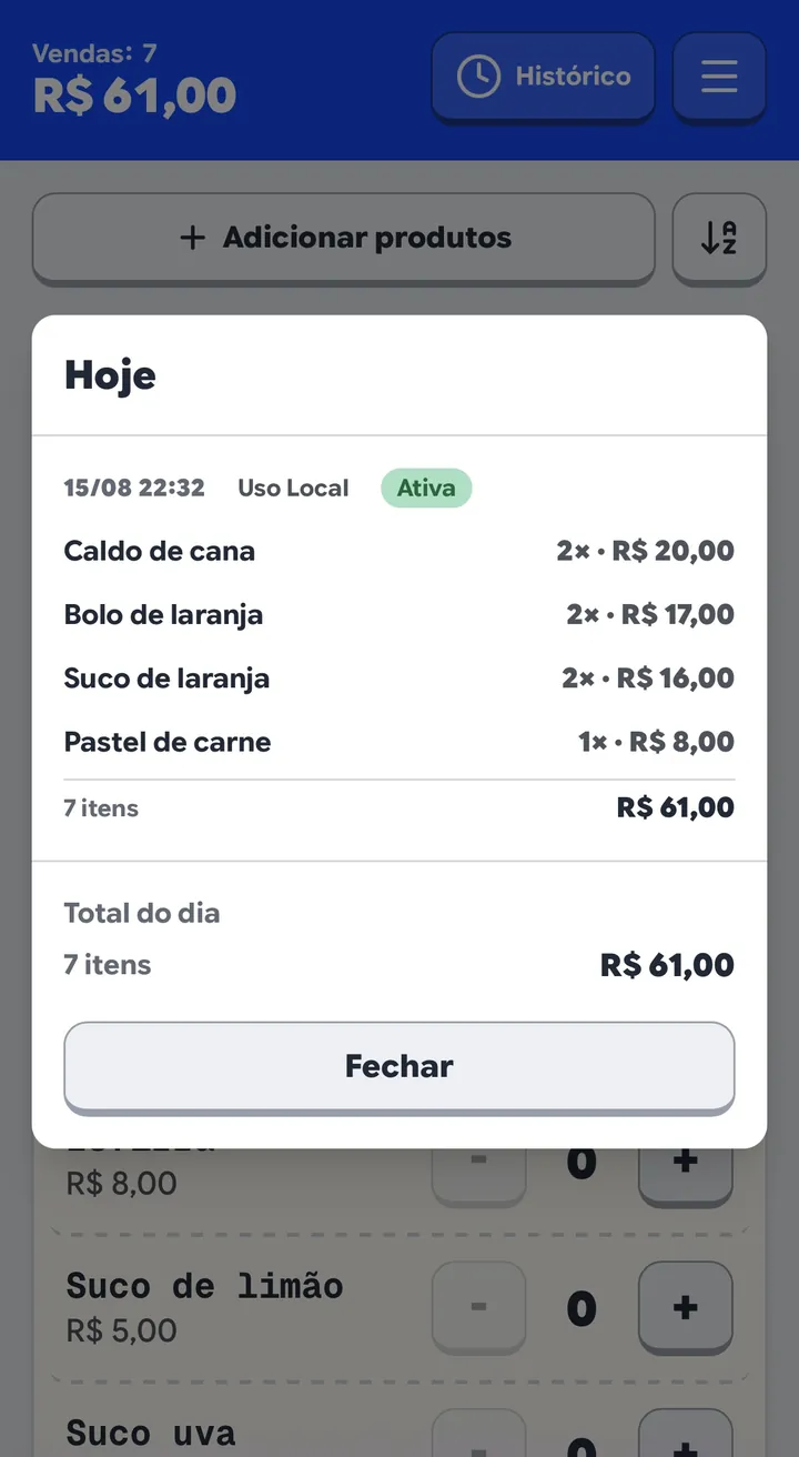
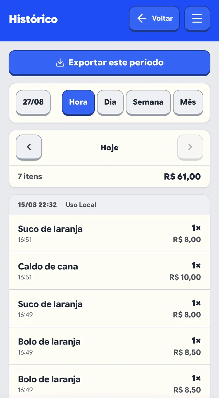
There is no shift closure button. Tapping the header counter opens the daily summary, and the day rolls over automatically when midnight passes. The history screen filters by hour, day, week, or month, and exports the selected timeframe in one tap directly into the native mobile share sheet. No bulky PDF reports nobody asked for.
What happens when 4G drops
In street markets, 4G signal drops constantly. Inside metal canopy stalls, it drops even worse. A sales app that requires a network connection to log a transaction is an app guaranteed to fail on the busiest festival day.
Hence, the architecture is strictly local-first. This is not an implementation detail; it is the core promise. All operational state lives on the physical device. Sales are committed locally, instantly, offline. The remote server handles opportunistic synchronization: when connectivity is restored, pending mutations upload seamlessly.
The resulting complexity—what to do when multiple devices diverge—was pushed into data modeling rather than UI complexity. The clearest example is customer credit tabs.
The credit tab ledger
Selling on store credit (tabs) is the most common pattern in local commerce, and the most poorly addressed by software. A vendor hands over goods, receives no cash, writes “Joe: 2 skewers” on the notebook’s back page, and settles the balance on Friday.
The obvious temptation is creating an outstanding_balance column on the customer table, adding and subtracting. That is the wrong path because of synchronization: two devices belonging to the same vendor will conflict over that scalar field, silently losing money when writes clash.
The architecture chose an append-only model: debt balance is never stored. It is always derived.
- Goods delivered without payment create a charge event, with item price frozen at delivery time.
- Cash settled on Friday creates a settlement event.
- Total outstanding debt is
Σ charges − Σ settlements, computed on demand.
There is no scalar balance field. Therefore, there is no field for multiple devices to clash over. State converges because event logs merge monotonically, producing identical calculations on all sides.
Additionally, a crucial business decision: credit tab sales never inflate today's cash flow. Goods leaving are not recognized revenue until cash enters the register. Tuesday’s register shows actual cash collected on Tuesday, not promises. Exactly how the paper notebook operated, and the only version that never lies.
When the vendor cooks to order
Meat skewers aren’t instant. Pastries take minutes in the fryer. An entire category of vendors struggles not with logging sales, but with remembering which customer owns which order on the grill.
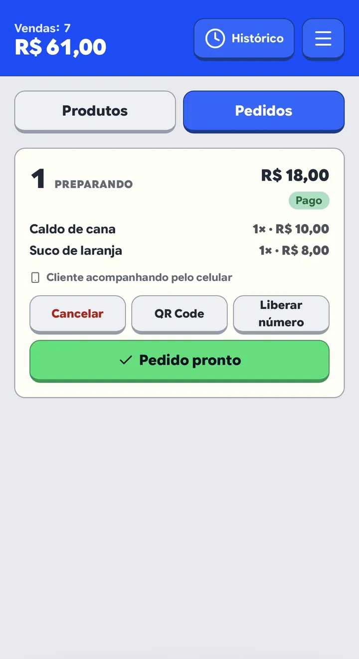
For them, Queue Mode exists, and it deliberately inverts the architecture. Here an order requires a globally coordinated number across devices and must be readable by customers with no account and no installed app. Local-first cannot solve this alone. In this mode, and only in this mode, the server acts as the source of truth.
The vendor builds the order as usual and confirms; the ticket is assigned a sequential number. Orders render as visual cards progressing across states: preparing, ready, delivered, paid.
Two customer paths, and why they expose different scopes
This is among the most refined security designs in the product, born out of an audit discovery.

Vendor shows device screen
Shows full order details
Upon order creation, the app renders a unique QR code for that specific ticket. The customer points their camera. No spoken numbers, no manual typing, no mishearing over street noise. The QR contains the order number and a cryptographic token proving the scanner was physically at the counter: itemized list, quantities, total, payment status, and live prep status.
Printed stall poster
Shows status only
A large, printed QR poster fixed to the stall banner, generated directly by the app. It links to the stall's public status page where customers type their ticket number. It displays live status (e.g. "Preparing" / "Ready"). It never exposes itemized contents or dollar amounts, prompting: “To view full items, ask for your order QR at the counter.”
This distinction is not a limitation. It is the entire security boundary.


The stall's URL is public by definition, printed on a poster where anyone can see it. If typing a simple integer like 1 or 2 yielded full receipt data, anyone seated nearby could iterate numbers and read everyone else's orders and spending.
The naive fix would be giving each ticket a spoken PIN (e.g. “Order 42, PIN 7391”). The customer would type both. In a loud, crowded market, that doubles verbal friction and doubles transcription errors.
The token still exists in full cryptographic strength, but nobody needs to speak or type it because it travels embedded within the dynamic QR code. The vendor turns the screen—far less effort than shouting numbers. The customer scans—far less effort than typing. And the printed poster remains a robust fallback for damaged cameras or tech-averse customers, showing only what is safe without physical counter proof.
QR binding is exclusive. Once an order is claimed by a customer device, it cannot be claimed by another; subsequent scans display an advisory to consult the vendor. This protects order ownership.
The poster path is non-exclusive, by deliberate design. Multiple companions at the same table can enter the same ticket number to watch for pickup alerts. Since only status is visible, zero private data is leaked.
Financial accounting remains strictly local. The moment the vendor marks a ticket as “Paid,” the app inserts local sale rows through the standard pipeline. Two architectures coexisting harmoniously where each makes sense, converging on a single clean interface.

My favorite engineering decision
The biggest roadblock in any point-of-sale app isn't day-to-day operation. It is initial catalog setup. Nobody wants to type 18 product names and prices into mobile form fields before selling their first skewer.
So the app offers two onboarding modes side-by-side as tabs:
Manual mode. Name and price, one product at a time. Predictable, works without internet, account, or AI, and remains available forever.
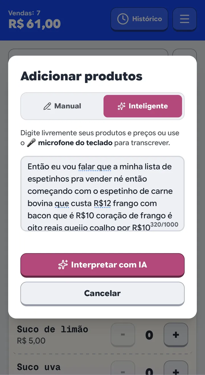
Natural text mode. A plain text area where vendors describe their menu naturally:
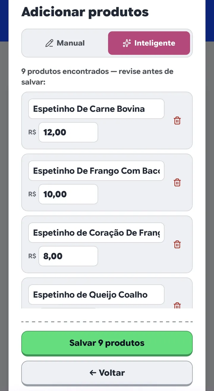
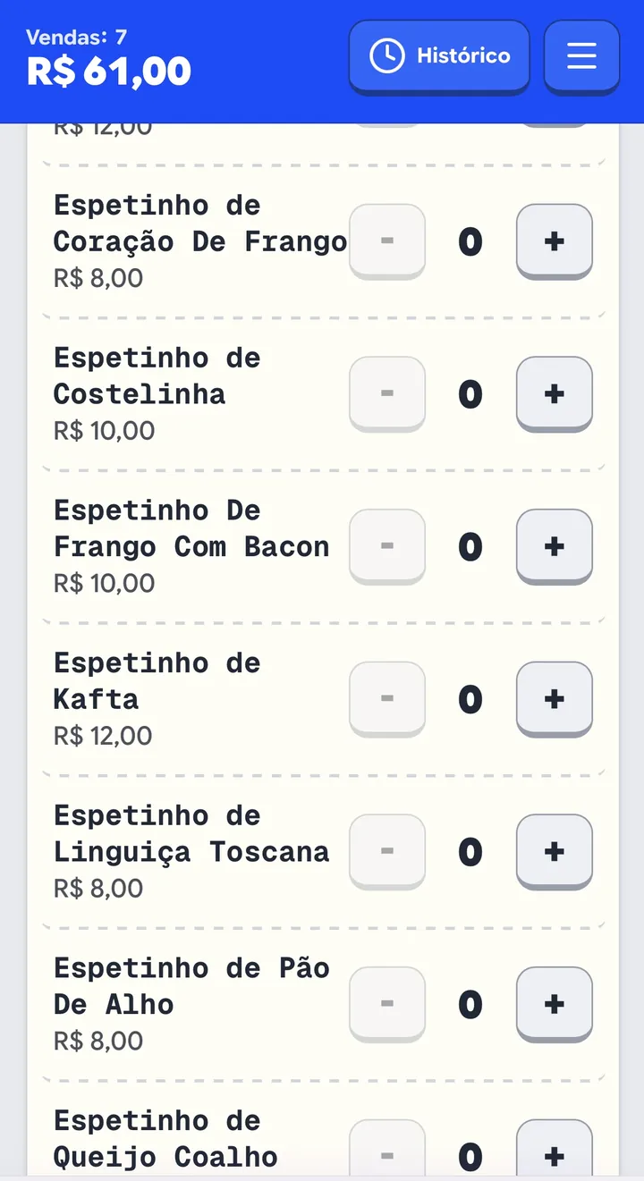
A server-side language model parses this natural description into a structured catalog, presenting an editable review table before committing to the database. Name and price, row by row, ready to adjust. AI suggests; the human decides.
Why this uses text, and never raw audio
Here is the architectural pattern I would take into any future product.
The standard, fashionable industry approach would be adding a prominent record button. The user speaks, the app uploads raw audio to a speech-to-text API, and a second model parses the resulting transcript. Two remote round-trips, two third-party bills, two failure points, and a hefty audio payload uploading over spotty 4G.
I built none of that. The input is a standard text area, and the microcopy above it reads:
Every mobile keyboard on iOS and Android already possesses a built-in dictation microphone. It transcribes audio on-device, for free, with native language models optimized for the user's voice and accent.
The architectural benefits compound across four fronts simultaneously:
- Cost. One text inference call instead of audio token pipelines.
- Bandwidth. Uploading kilobytes of text instead of megabytes of audio. On weak cell towers, this is the difference between working and failing.
- Privacy. Voice audio never leaves the vendor's device.
- Code surface. Zero audio recorders, zero media format codecs, zero microphone permissions to request, zero interrupted audio streams to recover. Code I didn't write is code I never have to debug.
And the user experience is unified: whether a user prefers speaking or typing, it’s the exact same text field. There are no divergent flows.
The gate running before AI
There is another essential piece: before spending an API token, a deterministic regular expression inspects whether the input actually resembles a menu—checking for word tokens paired with numeric values (either digits or written-out number words).
It understands written number words in Portuguese from “um” to “novecentos”, including colloquialisms like “meia” (half/six) and dialect spellings. Because speakers dictate words while typers use digits, and both must succeed.
If the input fails this gate, the UI immediately displays actionable guidance on what is missing, with zero network latency. Before this guard, the app would fail late with generic errors like “AI failed to process text,” which was inaccurate since the AI hadn't even executed.
Two benchmarks were measured and codified in tests:
- Worst-case regex input benchmark: 1.77 ms on 1,000 characters. Safe because 1,000 chars is an enforced upper ceiling on both client and server.
- The gate deliberately errs on the permissive side. Borderline queries pass through to inference, preventing false-negative rejections of legitimate menus.
Color measured, not guessed
Here is where the project became something else entirely.
The app features complete light and dark themes backed by design tokens. Components never reference raw color literals; they reference semantic roles: surface, fg, success, danger, warning. Theme switching involves zero conditional branches in component code.
That is good practice. What followed went further: I stopped picking colors and started calculating them.
The vibrant brand green is #00E175. On pure white, it achieves only 1.75:1 contrast, far below the 4.5:1 WCAG AA threshold. Consequently, that green is never used as text. It serves as background fills; foreground text uses a darkened, high-contrast hue. (This case study applies the same principle: green appears across borders and accents, never as text.)
Similarly, brand blue could not serve as the universal button blue for geometric arithmetic reasons. For white text to pass AA contrast over a tinted surface, the tint must be sufficiently light; for the tint to stand out against the page background, it must be sufficiently dark. Their intersection is mathematically empty. So two distinct blues were formulated:
| #004DFF | #2466FF | |
|---|---|---|
| white text on top | 5.99 | 4.75 |
| against light background | 4.97 | 3.94 |
| against dark background | 3.10 | 3.90 |
| against dark modal panel | 2.03 | 2.55 |
The deeper blue powers the header banner surface. The lighter blue powers interactive buttons, optimizing contrast across both dark and light modes.
Buttons are modeled as tactile keys: solid surfaces with a darker bottom edge providing physical relief. The formula is a single rule:
An edge from another family reads as two glued pieces, not a key. And what remains unified between buttons is the relief ratio (~2.20:1), not the multiplier: the same ⅔ yields 2.20:1 on green and only 1.70:1 on blue, because the blue face starts from lower luminance.
I originally wanted a unique accent color for credit tabs. When measured, every amber shade passing AA contrast across both themes landed within 8 to 15 degrees of the existing warning yellow—too close for human visual distinction.
There is no separate credit tab yellow. Conceptually, pending credit tabs and warning states represent the same fundamental domain state: an unresolved balance.
Every rule runs in CI as automated tests. Test runners inspect generated CSS and fail the build if any hue deviates from its palette family or fails WCAG AA contrast against its host surface. It is an automated gate, not aspirational documentation.
It exists because the manual alternative failed: a surface once shipped in hue 43 (brown) in dark theme while the rest of the palette lived between 213 and 222 (slate blue), tinting the product card with a foreign color. It passed all checks. tsc does not parse string colors. eslint does not parse string colors. The build generated the rule without complaint.
Typography and cross-platform rasterization
The app self-hosts two variable fonts: Google Sans Flex for interface UI and Geist Mono for product names and numeric figures. Self-hosting guarantees that street vendors never suffer FOIT/FOUT or third-party downtime at the market.
When font files were integrated, two geometric visual regression tests consistently failed in Linux CI while passing locally on macOS. The fonts had loaded, but layout bounding boxes diverged:
                       local macOS     Linux CI server
text content width        105.375         105.375   ← identical (font loaded)
button wrapper width      169.172         174.766   ← +5.6px divergence
Linux FreeType applies different glyph outline hinting than macOS CoreText, causing the same font file to yield distinct pixel widths under flex containers.
The solution was querying unhinted geometric layout bounds explicitly at the root level, standardizing cross-platform metrics to 69.375px exactly.
Other details that became automated tests
- All text inputs are at least 16px. Below 16px, iOS Safari auto-zooms on focus, causing viewport layout jumps. An automated AST scanner fails the build on any smaller input font size.
- Every dialog is a real dialog: announces itself to screen readers, closes on Escape, traps focus inside, and locks background body scrolling.
- Accessible name matches visible label (WCAG 2.5.3). For speech-control users, spoken commands match button text exactly.
- Browser
confirm()alerts were eliminated across all instances and replaced with native accessible modal dialogs.
The sound that never lies
The app plays an audio chime when a sale is confirmed. It sounds simple. It is governed by the strictest rule in the codebase:
Out of six audio triggers, four involve network mutations that can fail. If audio fired immediately inside the onClick handler, a vendor under spotty 4G would hear the success chime, the network write would fail, and they would proceed to the next customer. The app would have lied to them in the single moment they trusted it without looking at the screen.
Therefore, sound triggers strictly after the await resolves in the success branch. An automated static analysis test verifies that zero audio calls exist inside direct UI event handlers.
There is a crucial corollary: when a vendor double-taps confirm in haste, the second tap plays zero sound. No second sale took place. Playing a confirmation would be a false affirmation.
How I know it works
This is the part I take the most pride in, where the project evolved into an engineering discipline.
I started with standard tooling: TypeScript, ESLint, unit tests. Everything passed green. Yet during manual regression testing, I discovered nine distinct behavioral bugs—none of which were caught by the existing suite. All nine were already live in production.
The diagnosis was uncomfortable and clear: I had multiple layers reading code structure, and zero layers executing runtime behavior. Structural verification catches structural syntax errors. The entire class of sequential defects—state transitions firing out of order, lost focus traps, conditionally unrendered branches—passes through linters and type checkers without touching anything.
Today the product is guarded by four distinct testing tiers:
| Tier | What It Proves |
|---|---|
| Pure logic and code structure | Contract correctness; file declares X and caller invokes Y |
| Runtime (real DOM) | State transitions, focus movement, tree commits |
| Geometry (Chromium) | Panel transform contexts, layout shifts, container bounds |
| Database (real SQL) | Row-level security enforcement under standard user roles |
The full test suite executes in under 14 seconds. A verification suite that takes two minutes is a suite developers stop running.
# tier 1: logic and code structure
$ npm test
ℹ tests 392
ℹ pass 392
ℹ fail 0
ℹ duration_ms 1271.589542

# tier 2: behavior in real DOM
$ npm run test:runtime
ℹ tests 110
ℹ pass 110
ℹ fail 0
ℹ duration_ms 3035.397875

# tier 3: geometry in Chromium
$ npm run test:visual
  41 passed (48.0s)

# automated verification run per turn
$ time npm run verify
real 14.59
user 40.61
sys   4.29
It runs automatically. A git hook triggers verification at the end of every turn where code files changed, blocking commit completion on failure. Written guidelines ask; automated hooks enforce.
The example justifying the geometry tier
I almost skipped building the geometry test tier. Booting real Chromium instances to test CSS felt expensive. Here is the case that convinced me:
There was a CSS rule on modal panel containers: transform: none. Change it to transform: scale(1).
That passes TypeScript. Passes ESLint. Passes both runtime DOM test tiers. Passes Tailwind compilation. And looks invisible in code review because matrix(1, 0, 0, 1, 0, 0) is identity—the element moves zero pixels.
Except any CSS transform other than none forces the element to become the containing block for all fixed-position descendants. The date picker calendar inside the checkout modal, which should occupy the full viewport width, shrank to the width of the modal panel.
No static code review catches this. Only a real browser layout engine knows.
The rule that changed how I write tests
Every bug fix gets a test. That is standard. What is essential is the second half:
Without this step, you cannot prove whether the test actually guards the defect or merely runs in its vicinity. A test that was never seen failing is worse than no test—it consumes trust without delivering verification.
My favorite discovered bug
A simple question: how much is the active shopping cart worth right now?
Five different modules across the app calculated this. Under a specific race condition—when an item was deleted from the catalog while sitting in an active cart—they returned three conflicting answers simultaneously.
With discount: Vendor charged $ 2 → Register recorded: $ 14
This is the type of defect that fits in zero git diffs. None of the five files was incorrect in isolation; the flaw existed in the contradiction between them.
The solution was establishing a domain invariant: “Every item in the cart must exist in the active catalog.” Deleting a product automatically clears it from active carts, making all five readers correct by construction.
Without blueprints
The application implements defense-in-depth: Content Security Policy without inline script execution, strict HTTPS transport, Row-Level Security on all database tables, anonymous visitor lockdown, and append-only audit trails on administrative actions.
A previous audit had resolved two of them. The third was the exact routine writing the binding. A single canonical authorization function was established, backed by real integration test suites verifying that unauthorized mutations fail closed.
Reviewing the security fix itself
After implementing the fix, I audited the repair. It contained eight defects of its own.
And here is the takeaway: zero of the eight were found by reading code. All were surfaced through automated execution and adversarial platform tests.
Documentation that doesn't rot
The project contains 72 documents and roughly 45,000 lines of prose: design specs, implementation plans, audits. And one governing rule:
Documentation is permanent; code evolves. Static assertions decay over time. Writing the rediscovery command (the SQL query, the grep pattern) converts the documentation decay rate to zero.
What the numbers reveal
The final metric completes the loop: 210 KB. Smaller than a single smartphone photo. An app designed for low-cost hardware over weak cell connectivity cannot afford a 4MB payload.
Key takeaways
- The right constraint eliminates more bloat than any roadmap. “Two taps” was not a vanity goal; it was an active filter against unnecessary complexity.
- The best AI solution is often the one that uses the least AI. Leveraging built-in mobile keyboard dictation delivered better speed, zero API cost, and total user privacy.
- Measurement outperforms guesswork. Mathematical contrast modeling produced a cleaner, more accessible interface than subjective color picking.
- Reading code is not verifying code. Rigorous automated test execution is the only reliable proof of runtime behavior.
- Every core question needs a named owner. Divergent calculations across multiple modules cost real money and user trust.
- Green test results must be trustworthy. False-passing tests and decaying docs erode project velocity.
- Paper is a formidable competitor. Physical notebooks have zero boot time, require zero battery, and never disconnect. Software must compete on reduced friction, not bloated features.
The sidewalk street vendor still uses his notebook, and that is completely fine. I didn't build this to force a change. I built it to discover whether software could match the speed of paper. It can. Two finger taps, automatic shift balancing, and complete offline resilience.
The rest—the 502 tests, 73 migrations, and measured color tokens—exist so those two taps never fail.